It is low resolution, but it is a piece I have never seen before. Another piece, Birch Trees in Winter, was included with the many photos Sisters of Charity and Clarke University sent to me.
Screenshot from Sisters of Charity online newsletter
I am assuming as with many of her other abstracts, this is very large in format. I don’t know the year or size. I have some information coming to me from Dubuqe Iowa Museum of Art.
Photo provided by the Sisters of Charity, BVM, Mt. Carmel in Dubuque, Iowa
This large painting, which I call Blue Triumph, is part of the permanent collection at Clarke University. The date my aunt painted this is unknown, but it would be prior to her leaving to go to San Francisco in the late 60s. This could be late 1950s or early 1960s. My best guess is approximately 1966.
I am not a world traveler! Does the large blue structure, center left, look familiar? This shape, which I associate with the modern Under Armor logo, appears in many of her paintings, but none as large as this one. I could be mistaken, but I see shades of suggestion that this represents the base of the Eiffel Tower.
The perspective is a low to high vantage point. I’ve studied the painting a long time. I see a young girl in the bottom right, her tawny face in profile, mouth agape at she takes in the splendor of the structure. I see her wearing a blue beret that has slid onto the back of her head, almost touching the knapsack she straddles on her shoulders. This girl is a student tourist, perhaps one of my aunt’s students from Clarke.
The sky is mottled with intensites of blue. Hints of green lawn tell me this is a spring or summer visit. An early morning or late afternoon sun bounces of the arch and bathes the sidewalk with sunlight. A red flag on the structure hovers directly above the girl’s forehead.
Okay, this is a misleading title. But I just watched the HBO documentary on artist Robert De Niro, Sr., a project created by his son, actor Robert De Niro. I was moved by De Niro’s passion to honor his father’s artistic vision and elevate the recognition of his father’s body of work. In her day, my aunt enjoyed local recognition, but as a nun, she did not make her living off of her art. Modesty, not self-promotion, surely kept her from being more widely known. Like Robert De Niro, I am immensely proud of my artist-relative. I would love nothing more than to give her wider exposure and recognition. I beleive there are many of her paintings out there, unheralded. People may not recognize the signature or have any background information on the artist whose work hangs in homes, apartments, galleries and offered up for cheap at yard sales and auctions.
Although my aunt did not live in New York, I’m certain she knew about the movement and shared similar influences that factored into De Niro’s work with the New York School. She and Robert De Niro came of age in the same era, and perhaps influenced by European aethetics, saw their art as a way to burst free from regulations, confines and conventions. Beyond just being an artist herself, she was an art enthusiast and educator. It was her business to know. She may have traveled in New York (in that era she always had to travel with a companion), but not in their circles. Nevertheless, I would be shocked if she didn’t know and admire the work of De Niro’s parents and thier contemporaries.
His documentary, much like this website, is a labor of love. Enjoy:
I’ve had this image for a while, shared with me in photo by Sr. Sara at Clarke. Time permits me to take another, closer look at some of her paintings and I am finding more to say about each as I study them closer.
Modern street scene
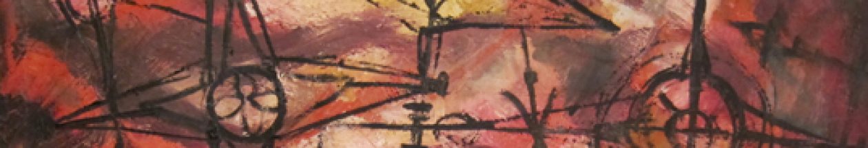
I originally called this “cells” but this looks very urban to me—it could be scaffolding going up in a city. The lower rectangle or bottom layer look taller than the one above. I see a door, center right, I see a distant skyline top center left (outlined) and a larger more diffused, taller skyline at top right. On the left, a lamp post or sign post is visible. Quite a lot going on in each shape, cell or section, and ebb and flow traveling through each compartment is nonexistent. Each cell has its own separate activity and color palate. They do blend however in the street/sidewalk reflection.
At the top layer, two cells have X’s spanning them and a third is suggested far left. My aunt employes this crisscrossing pattern frequently in her work. Take a look at the top right square. If you are familiar with my aunt’s earliest BVM habit, what could be interpreted as a boxy black and white habit is softly suggested. It is on the left side of that top square. Maybe that is a stretch on my part.
But there is something going on in each section—everything it its own neat environment— but on the outside, they all contribute to a combined glow – a reflection of the vibrancy of diverse lives in a multi-unit building or structure.
What is most fascinating is that it is very unlikely my aunt ever walked city streets at night. Before Vatican II, any time she left the convent she always had to travel with a companion sister. When my father met her for the first time in the late 1940s, she had a nun buddy with her. I am not sure when she traveled to Europe, what her restrictions were regarding wandering around urban areas at night.
How much of this is her imagination I cannot say. It looks very NYC to me, or Chicago. There is the suggestion of a little hillside village or suburb on the left, so it may be the juxtaposition of two different cultures. What ever location it depicts, it is vibrant and interesting. A print of this would be something to treasure and enjoy and reflect upon.
Yesterday, out of the blue, I received the following email generated from the contact form of this blog from a G. Walker. It read:
Comment: Hi, I happened across this work of art listed on the following web. http://anorangemoonchicago.blogspot.com/
scroll down to September 1, Sister Mary “Scraphia”
As I found it interesting, I believed the seller misread the signature and I began a brief Internet search for Sister Mary Seraphia and found your website about your Aunt’s amazing work. Maybe it was one of her earlier pieces? I have been to An Orange Moon previously in search of mid century furniture. The owner is quite nice. I would be interested to see if this is one of your Aunt’s works. Good Luck!
Modern, mid-twentieth century still life signed by "Sister Mary Seraphia". I believe this to be the work of my aunt, Sister Mary James Ann Walsh
I immediately visited AnOrangeMoon and found the painting. It looks like my aunt’s work! Certainly, turning up in the Chicago area makes sense, as this was her hometown. However, I never knew my aunt to use her given name of Seraphia. I agree, I think the signature is a misread:
The ‘e” in sister closely resembles what should be the “e” not “c” in Seraphia/Scraphia. The handwriting looks like my aunt’s.
How many nuns, with access to the Chicago area, who painted modern, abstract art in the 1950s and 1960s named “Seraphia” can there possibly be?
This must be her! I never knew her to use her name in any of her artwork, nor did she use it in her personal correspondence with her family. She always used her official BVM name, either spelled out or initialed as SMJA.
Just to be certain, I’ve searched the Web for any other possible explanation or identity for Mary Seraphia. I found a handful of nuns from different orders who went by this name, but none of them came from an art background, taught art, etc. Nor did I find any other work posted under Sister Mary Seraphia.
I must draw the conclusion, that for reasons unknown, my aunt experimented with a pseudonym!
The work is for sale and I have contact the owner, Lynne, of An Orange Moon and she has agreed to sell it to me at a generously fair price. I am indebted to Lynne and to G. Walker who first told me about the painting being for sale. The owner is going to check for me how they acquired the painting. Lynne believes it came from an estate sale, as that is usually the source of her acquisitions. Whose estate it came form may provide very important clues to erasing any doubt this was done by my aunt. I am the proverbial 99.9 percent sure this is my aunt’s work!
The painting is very large, around 3 feet, a format that my aunt favored. The heavy lines shaping the jugs and bottles are in keeping with much of the work I have posted on this site. She painted still lifes, and some are listed in the missing work page.
My guess is that she may have painted this for someone she knew, someone who may have known her as “Seraphia” perhaps a family member. When my mother moved from Chicago to marry my father in Delaware, she lost contact with her Illinois cousins – so I have no contacts to ask or inquire on my behalf. Perhaps the back of the painting will provide clues.
I do not have any closeups of her SMJA signatures. I have contacted Sr. Sara at Clarke with this news and perhaps I can get some side by side comparison’s of signatures. I am curious to know what those who knew her think!
If Sister Mary Seraphia was her alias or pseudonym, it provides me with a whole new search criteria to explore and an opportunity to locate other missing work. If anyone knows of an entirely different person/artist known as “Sister Mary Seraphia” I would appreciate knowing so that I don’t pursue a detour or acquire any more paintings. If I am wrong about this, I’ll have a Picasso-eque piece to hang on the wall. But I think this was a safe investment, what do you think?
Update 10/12/11: Lynn texted me and her records indicate the painting came from an estate in Bridgeview, Ill. I’ve never heard Bridgeview mentioned by my mother or aunt – I wonder if it was a family friend or a relative?I’ve asked Lynne to see who might have managed the estate sale and obtain a contact that may provide me with further clues. The painting is on its way to me and I eagerly await its arrival and placement in my home!
10/23/11 Update:
The painting has arrived. Here I am with it hanging in my dining room. Like my mother, I think I am going to have to redecorate my room around this painting!
Me with my aunt's painting, likely done in the late 50s or early 60s
Actual title, year, medium unknown. Courtesy of Clarke University
I called this Forgiveness because I see a figure kneeling in the middle of the painting, it’s hands outstretched and palms up. It faces a great white light and touches the light peripherally, as does one knee. Most of the figure remains in the natural world, with browns, dark golds and greens on the outside, and a heated red-orange closer to the figure.
The red-orange may represent evil, or the fires of hell. This person is in the hotseat, in the middle of heated passion or turmoil.
This figure has hope. Through prayer, he calls back the blessings and peace of a higher power. The goodness of God, his grace, his forgiveness is approaching and is moving toward the figure.There is some white in the center that could be the hand of God, ready to embrace the figure.
Title and year unknown. Courtesy of Clarke University
My aunt clearly, returned to themes of good vs. evil, light against dark. To the left I see at least three faceless figures (with dark hair), and maybe more with lighter hair, huddled together, basking in the light, in protection of white and yellow light. To the right, ceding the canvas’ territory to the light figures, is a red figure.
He is evil. He is the Devil. His large eye is fixed on his target, his claw-like hand reaching in to grab. Or,is it recoiling back- unable to penetrate God’s protection? I think the latter.
These are just initial impressions. More on this painting later. Nine more to post!
Due to the over the top kindness of Dr. Sara McAlpin, BVM, I am now in possession of an additional dozen photographs of paintings done by my aunt. Sr. Sara, words cannot convey my gratitude for you time in locating these paintings that were hidden or stored at Clarke University, for arranging to have them transported to a well-lit room, put on an easel and photographed so well.
I am going to post each into its very own blog post. They came to me untitled and undated. I do not think any of these 12 are images that are listed under the Missing Work page. Those titles were reproduced from a 1957 Gallery exposition, and from that era, my aunt’s work seems to be more realistic, albeit impressionistic in nature. You see a house, a tree, etc. There is little argument what she was painting in her earlier work (what I have seen of it anyway!) These new additions appear to have been created in the early-mid 60s, painted before she left Iowa for California. They are more abstract, turbulent, and fluid. I see her experimenting with technique, investigating the forces of light and dark, good and evil. She plays with forms. I suspect she would have made a great engineer or architect. My aunt, in my opinion, greatly appreciated the elements of design, particularly of buildings. That is what I see anyway. How about you?
As with the old images I have posted, as these emerge, I invite you to comment on them, and share your opinion. I’d appreciate that very much- and later, when the time comes to formalize all this in an academic exercise, I might seek your permission to reprint your ideas in my thesis.
Since none of these are named, and the pictures came to me in digital format with numbers, I used free-association to name each. I might change my mind on the image’s working title, but for now, I will label them with my first impression. They are easier to keep track of that way!
As I have only these photos, I do not know what medium they were painted with and on what surface.
Enjoy! And Sara, again, you have given me, and my family a wonderful gift. Thank you so much!
Always follow your hunches! When I found out my aunt had produced all this artwork 50 years ago, I had no idea how I might begin tracking it all down. On a lark, I posted an add in the Dubuqe Iowa category of Craiglist and I got a hit! A good one!
After a few emails back and forth a very nice lady (who shall remain nameless until I get her permission) told me her dad had a painting by a nun, acquired around 1966. She confirmed it was large and very modern. A few days later, I got an email saying, “It’s by her!”
I mean, what are the chances of that?!?! I feel my aunt is guiding me in this quest. This is a blessing beyond words.
I’ll post an image as soon as she sends one to me, and if they give me permission to post it. It is after all, their painting, not mine. But I am so excited to actually connect with a real human being- someone who has a part of my aunt with them. How cool is this? I am just thrilled beyond words! Stay tuned!
Rate this:
Portrait of a mid-century contemporary artist, AKA Ann Walsh


