All posts by Michele Walfred

I am a communications specialist at the University of Delaware. I blog about Thomas Nast and editorial cartoons, art history, journalism, fine arts, photography, agriculture, gardening, and social media.

Nunsense

Sharing this website that I rediscovered from two years ago. Very interesting to learn about Cranbrook.

Cranbrook Kitchen Sink

Over the past few years, I have listened to researchers in the Archives and visitors to the museum describe works of art as divine or heavenly, but I don’t remember those words used to describe the artist. Until now. Did you know that during the 1950s-1960s there were several artists who studied at the Academy of Art who were also members of a divine order? Admittedly, I have not had much interaction with nuns in my lifetime, but I have a keen fascination (cue: “The hills are alive with the sound of music..”).

Sister Mary James Ann Walsh, BVM (Order of the Blessed Virgin Mary) was one of several nuns to study at the Academy where she received her MFA in painting in 1955. In 1953, Sister Mary was the First Prize Winner of the 9th Annual Iowa Water Color Show for her piece, “Ecce Homo

View original post 372 more words

Abstract watercolor

I learned of a new piece, titled “Abstract watercolor” that is being placed in exhibit at the 

Below is a cropped image from the Sisters of Charity online update.

It is low resolution, but it is a piece I have never seen before. Another piece, Birch Trees in Winter, was included with the many photos Sisters of Charity and Clarke University sent to me.


Screenshot from Sisters of Charity online newsletter
 
I am assuming as with many of her other abstracts, this is very large in format. I don’t know the year or size. I have some information coming to me from Dubuqe Iowa Museum of Art.

Blue Triumph 12/12

Photo provided by the Sisters of Charity, BVM, Mt. Carmel in Dubuque, Iowa

This large painting, which I call Blue Triumph, is part of the permanent collection at Clarke University. The date my aunt painted this is unknown, but it would be prior to her leaving to go to San Francisco in the late 60s. This could be late 1950s or early 1960s. My best guess is approximately 1966.

I am not a world traveler! Does the large blue structure, center left, look familiar?  This shape, which I associate with the modern Under Armor logo, appears in many of her paintings, but none as large as this one. I could be mistaken, but I see shades of suggestion that this represents the base of the Eiffel Tower.

The perspective is a low to high vantage point. I’ve studied the painting a long time. I see a young girl in the bottom right, her tawny face in profile, mouth agape at she takes in the splendor of the structure. I see her wearing a blue beret that has slid onto the back of her head, almost touching the knapsack she straddles on her shoulders. This girl is a student tourist, perhaps one of my aunt’s students from Clarke.

The sky is mottled with intensites of blue. Hints of green lawn tell me this is a spring or summer visit. An early morning or late afternoon sun bounces of the arch and bathes the sidewalk with sunlight. A red flag on the structure hovers directly above the girl’s forehead.

What do you think?

Pioneer Angelus, where are you?

One of the pieces I am most eager to see or have a photo of is Pioneer Angelus, a large mural painted by my aunt as her final assignment for her Master of Arts degree at University of Iowa State (SUI).

For many years, the mural hung in the Eliza stairwell at Clarke. According to her student Verna Friedman, Pioneer Angelus was taken down in 1958. Its whereabouts today are unknown. Neither Clarke University nor Mt. Carmel know what happened to the painting.

It can’t be that easy to hide. Measuring 4.5ft. x 8ft, this large work could not have been accidentally tossed.  That Clarke or the Sisters of Charity do not have custody of this, when they have other less acclaimed work is unusual.

The whereabout of this 4.5 x 8ft mural are unknown.

According to Sisters of Charity information sent to me, the following note from 1941 was said of Pioneer Angelus:
“The beginning of Catholicism in the Mississippi Valley has been enshrined on canvas by Sister Mary James Ann Walsh, B.V.M., in a mural, “Pioneer Angelus” recently completed as a thesis requirement for the Master of Arts degree in graphic and plastic art, at the State University of Iowa, Iowa City.”

“In choosing such a subject for her masterpiece, Sister Mary James Ann has depicted an incident, the ringing of the first Angelus in Dubuque, that is cosely bound to the early history of our congregation and dear to the descendants of the Catholic pioneers of Dubuque. The painting is an ever vivid reminder of these spirit of courage, generosity, devotion, and holiness of those who foster the religious beginnings.”

So what happened to Pioneer Angelus? My guess is that Pioneer Angelus either fell victim to a fire, or other damage while in storage, sold to raise funds or donated to a Catholic institution where its historical relevance would be appreciated and cared for in perpetuity.

In the World Wide Web, the search engine has become a valuable conduit for me and for others vested in a common interest.The Internet has allowed me to stretch my arms and probe a region and area that would be otherwise out of my reach. My hope is that this mural still exists and someone may encounter it and out of curiosity, enter its creator into Bing, Google or other search engine.

This is one painting I wish to experience. I would love to see a color image. It is a key expression of my aunt’s faith and technique.

My next step is to contact Catholic institutions in the Midwest, concentrating on Iowa and surrounding areas and send them a copy of this link. Likely, whoever is custodian of this remarkable work might not be aware there is outside interest.

As I near the final stages of my own master’s degree, I juggle different ways in which I may present the capstone of my research. An academic paper? Perhaps. I’m wordy and no stranger to footnotes and citations! But my MALS program also encourages its student to package the research in an accessible manner. I could apply for grants and set up a gallery showing of her body of work. I could obtain prints and copies and have a Delaware debut of her abstracts. I could create a virtual museum (something that intrigues me and would have to partner a Web developer to make happen) author a book of her work with lovely glossy plates, or perhaps, partner with Clarke and Mt. Carmel BVM mother house in creating a venue to showcase and market the artistic talents of their Sisters, past, present and future, or some other venture.

A virtual, online BVM gallery and gift shop could serve two purposes. There would be a e-commerce site, replete with SMJA scarves (wouldn’t “Bridges” make a great scarf?) cards & notes, and prints. It would get the word out, fulfill a niche market in 50s and 60s art and culture, and at the same or over time, produce some revenue that could be reinvested into printmaking, etc.

But I digress. There are more images out there to be discovered and enjoyed – Pioneer Angelus is not the only missing work, but it is a significant one to locate. Finding out where it is and how it got to where it is will be a story worth telling.

I plan to visit Clarke and Mt. Carmel next summer and want to view and photograph as many of her paintings as I can. If my prayers are answered, Pioneer Angelus will be on my itinerary!

Robert De Niro and me

Okay, this is a misleading title. But I just watched the HBO documentary on artist Robert De Niro, Sr., a project created by his son, actor Robert De Niro. I was moved by De Niro’s passion to honor his father’s artistic vision and elevate the recognition of his father’s body of work. In her day, my aunt enjoyed local recognition, but as a nun, she did not make her living off of her art. Modesty, not self-promotion, surely kept her from being more widely known. Like Robert De Niro, I am immensely proud of my artist-relative. I would love nothing more than to give her wider exposure and recognition. I beleive there are many of her paintings out there, unheralded. People may not recognize the signature or have any background information on the artist whose work hangs in homes, apartments, galleries and offered up for cheap at yard sales and auctions. 

Although my aunt did not live in New York, I’m certain she knew about the movement and shared similar influences that factored into De Niro’s work with the New York School. She and Robert De Niro came of age in the same era, and perhaps influenced by European aethetics, saw their art as a way to burst free from regulations, confines and conventions. Beyond just being an artist herself, she was an art enthusiast and educator. It was her business to know. She may have traveled in New York (in that era she always had to travel with a companion), but not  in their circles. Nevertheless,  I would be shocked if she didn’t know and admire the work of De Niro’s parents and thier contemporaries. 

His documentary, much like this website, is a labor of love.  Enjoy:

Why art matters

I love this quote from Rodney Allen Schwartz, director of the Westminster Presbyterian Church Gallery and Archive:

“Art matters because it provides a communication tool between an artist or designer and the diverse audience who encounters the art. This encounter may generate thought, stimulate conversation, or evoke emotion.

When we first wake up and become aware of light and shape around us, we see. This is a passive experience. We look when we focus our attention on specific objects, images, or details. Looking is active and engaging.

A beautiful piece of art is pleasing to the eye and soul. Sometimes sad and ugly stories need telling and they might be disturbing and uncomfortable. These scenarios share a common goal: to capture attention and to elicit a reaction. Sometimes thinking is more important than liking.” ~ Rodney Allen Schwartz

This gallery will soon feature one of my aunt’s paintings, Iron Crosses, Bruges.

Iron Crosses, Bruges – update

After a flurry of emails back and forth, I was connected to Chris van Lierop, whose parents were Rev. Richard E. Nelson and Mrs. Dorothy Rawlings Nelson.

I received this lovely note from Chris:

“I looked again at your website. Iron Crosses is in the background of the newspaper photo dated Feb 18, 1960. That article mentions Cedar Falls. I assume that my parents met Sister Mary James Ann at that time.

My father was campus pastor at Norther Iowa U at that time. In that capacity, he organized exhibits of religious art at the student center on campus on Serely Blvd. We lived in that building when I was born in 1956 and for the first three years of my life. I had assumed that my parents met Sister in connection with one of the exhibits they organized. But perhaps it was at the other exhibit in Cedar Falls mentioned in the article.”

My family moved to Duluth, MN, in 1964. Iron Crosses hung in our dining room there for 45 years!

Chris also shared that Iron Crosses, Bruges was donated to the Westminster Presbyterian Church in Minneapolis.  She provided me with a photo that was provided by Dr. Rodney Allen Schwartz, director of the Westminster Gallery and Archive, who has given me permission to use it here:

Iron Crosses, Bruges is inspired by a cemetery in Belgium that features hundreds of iron crosses slowly rusting.  Courtesy of Westminster Presbyterian Church, Minneapolis

However, Chris did inform me that the painting in the background of this clipping is Iron Crosses, Bruges. I would have never known unless I saw the original!

Iron Crosses, Bruges is behind my aunt on the wall. It is vibrant in reds, golds, oranges and pinks! News clippings provided by Clarke College (University).

According to a 1960 article SisterJamesAnn_1960, my aunt was inspired to create this along with many other images during an art student tour of Europe.

I have never been to Belgium, but I was curious about what my aunt may have been looking at.  I found this picture from a Google search – I couldn’t find who owns it but it was on a website called dipity.com

Iron Crosses, photo found on dipity.com

I also found this YouTube video searching for photographs. Not all of the images shown in this video are of crosses made of iron. Some ornate crosses are found individually on top of headstones, and this collection, set to lovely music, shows the same area photographed above, but dusted with snow. I think it sets a pensive tone.

Chris is also going to try and find some old family photographs where the painting hung in the dining room!  The painting was 48″ by 34″ tall.

I will discuss the detail of the image at a later date here.

eBay one day, thrift store the next!

More and more I am reminded of the power of the Internet and realizing the purpose of this website!

On January 2o, 2012, I received the following message, which came from the contact feature in this blog. It said:

“This is why I am an art collector. Because it’s a journey of discovery. And today, in a thrift store in Maryland, I discovered your aunt. I bought a large (29×39 framed) painting of trees (I guess), black, against an abstract and evocative background with splashes of pale green. Looks like ink and watercolor on heavy paper. This is the kind of painting that gets your attention. And it’s signed “Sister Mary James Ann BVM 1955″ Original framing. Email me, and I will send photos.”

The writer of the message has asked to remain anonymous, but offered pictures. Of course, I jumped all over it. And true to his word, he sent me some photos of his new acquisition yesterday evening.

This painting was signed and dated 1955

A close up photo shows her familiar signature, and the date…the year I was born!

Signature seems to have been done in ink, going up the right side of the painting

The technique reminds me in a way of Japanese Sumi or India ink used in calligraphy. Here is another photo:

Image with frame

The painting of trees is somewhat reminiscent of her Birch Trees in Winter. She certainly used the same color palate, though Birch Trees is an oil:

Birch Trees in Winter, early 50s?, courtesy of Sisters of Charity

What at first glanced look like a stain of yellow in the thrift store find, is actually an intentional green watercolor wash. The owner says that it looks more green in person than what is rendered by the photo. This may have been her way of showing the emergence of spring…a snowy landscape yielding to fresh, early green grass, moss and forest floor underneath.  The trees in the foreground, being conical evergreens, are the dominant vegetation.  The striations of of ink and watercolor suggest a melting, nourishing rain.

In a subsequent email, the owner shared the following:

“The bold black shapes are painted with something very thick, that looks like it was sort of sticky when wet.  The horizontal background elements and the fuzzy areas are definitely watercolor.  The pale yellowish spots are, I’m fairly sure, watercolor.  They look more green than in the pictures.”

I asked him what his opinions were about the style.

“I  am a collector–not an expert!  But I do feel that this painting captures its time perfectly.  To me, it just screams “1955!” Framed without glass, common at the time.  I will likely reframe with glass.”

I am hopeful that the new owner will grant me a personal audience with the piece one day. Not sure if he also lives in Maryland, or was just passing through.  But it would definitely be worth a day trip! Nothing can replace gazing upon a work of art with one’s own eye. Otherwise we’d just have books and no museums!

This is an exciting development for me. Each piece I have discovered since this journey began has its own unique look.  Because she was both an artist and a teacher, I see my aunt’s progression in these revelations –  exploring and experimenting with styles, materials and techniques. She certainly did not pigeonhole herself, though I do see threads of similarity in her work, it is also evident that she pushed herself in many different directions, for her own artistic adventure and also in order to offer her students a fuller and broader artistic experience that she had personally shared.

People find treasures in all sorts of places. For someone, this painting was not meaningful enough to hold onto, and I can imagine many circumstances of how it might have ended up in a thrift store in central Maryland. Most of us who’ve watched Antiques Roadshow know that many treasures are buried in plain sight. Just over half a century ago, this work and others were likely exhibited in a  local gallery. A modest price tag was affixed and someone decided to take it home.  It probably was born in Iowa and changed hands along the way, both appreciated and ignored as it journeyed to to Maryland.  Someone’s junk is often someone else’s treasure. Art is about communication, about emotion, about message…in this case, the painting survived decades and traveled thousands of miles and called to that special individual in order to meet with its new home and destiny!

As I had hoped, curiosity led to a search engine inquiry and a connection through my website. A new owner of my aunt’s art now knows a little bit more about her…and I in turn am able to add another piece of her artistic life to her biography.  I think it’s been a fair exchange. That others did and continue to appreciate her work was never in question, but it is wonderful to have it confirmed and validated by others.

Thank you sir, for your eye, for your curiosity and most of all, thank you for sharing this with me…with everyone!

A Justin Bieber toothbrush Groupon ad leads to a new art discovery

The amazing twists and turns of social networking, email, Twitter and eBay

After seeing creative Groupon commercials at the 2011 Superbowl, I decided to take a look at the new Internet upstart and eventually signed up to receive notices of interesting local deals.  Since then, my email inbox has received a wide variety of enticing Groupon offers to save on services and products.

Last week, one offer in particular tickled my funny bone. It was for a Justin Bieber singing toothbrush. In my day, it might have been a Bobby Sherman toothbrush. His pearly whites took center stage on many a Tiger Beat magazine cover, but alas, technology was decades away from Bobby, Donny Osmond and other dentally endowded heartthrobs of the 1960s. They had to settle for lunchboxes.

But I digress in my story. I found the Bieber bristles funny enough to post on Twitter. I was not the only one who did so.  A fellow local Twitter friend @lifeontheedges thought it was funny too. Our Bieber bond prompted her to check out my profile and visit this site which shows up as my  featured link.  She read this blog and found it interesting. (smile).

Enough so that we started a mini-conversation and she decided to do an eBay alert check on my behalf. She got a hit for me!

And there I saw a new painting, signed by S.M.James Ann, and titled “An Amazing and beautiful abstract painting on wedges by Seraphia Angela Walsh.” It was listed at an out of reach price for my modest budget, but it was wonderful to see. The seller had obviously researched the signature and found this blog, the only online source that links my aunt’s birth name to her BVM identity.

Signature as shown on eBay by Estate Decor

The seller  later changed the auction title to match the signature. The listing was by Estate-Decor, who maintain an eBay seller store on art and antiques. They are based in Rego Park, NY.

Emails went back and forth, and to make a long and interesting story very short, we agreed on a  fair price. Estate-Decor understood the family connection and its meaning to me. I can’t thank them enough for their fair dealings, and desire to place a painting where it will be loved, treasured and handed down to family. Thank you!

Thanks also to my Twitter friend for taking the time to care, for being curious. How a simple spark of “I wonder…” started a process! By acting on an impulse and on my behalf, another piece of my aunt’s visual history has been put in place and a beautiful painting is on its way to me. My pocketbook is a little lighter, but my research and my family are so much richer for it.

Simple things can and do connect us. The Internet can be an anonymous, cold and calculating platform in which to transact and scam. But my experience with this project has been to meet people who care. From Craigslist to Clarke, BVMs to Bieber, students and strangers, through WordPress, Facebook,Twitter, eBay and email; kind-hearted people have emerged, shared and taken initiative.   I knew about eBay alerts. I believe someone else told me about them, but I never followed through on the idea.  My mind, creatively scatterbrained as can be at times, flits, skips and jumps on many ideas, curiosities, shiny things, and other daily ephemera. It doesn’t always land where it should. This time around, Lifeontheedges had my back. Thank you!  Thank you all!

Here is a screenshot from the eBay posting.  It is on its way to my home. I will post more pictures once it’s on the wall. Ladies and gentlemen, and dear, dear friends, may I present “Wedges”…

Painted in Iowa, found for sale in NY, suggested date of 1958, it's on its way to Delaware!

High school discovery from 1929!

Thanks to Loyola Library Digital Collection (thanks Wikipedia for pointing me there) I was able to confirm that my aunt did indeed graduate from Immaculata High School in Chicago nine years before my mother did. Seraphia Walsh was in the class of 1930, and is mentioned in many articles and school documents. Her interest in art was well established.

Using advanced search, I was able to find this very early treasure, drawn for a school program when she was 15 and a half years old.  Her calligraphy was always outstanding. This program shows her interest in art and calligraphy. Even at 15, she thought to create key letters as musical notes. I was thrilled beyond belief to find a piece from her youth. Her name is credited at the bottom, highlighted as part of my search result!

A high school program drawn by my aunt in her junior year, at  age 15. Scan source: Loyola Library Digital Collection

Ed Demers’ memories

Edmund Demers was a lay faculty member at Clarke College during the time my aunt was chair of the Clarke College art department.  He was quoted in Time Magazine about his work at Clarke, and Ed’s talents were profiled in a SALT 2007 article (Sisters of Charity publication).

Earlier in 2011, I was able to reach Dr. Demers by phone at his home in Mass. and I sent him some printouts of my early blog pages. He responded with a lovely letter, some of which I have excerpted here:

“On the list of missing works, the “Man from Maine” this came about when I returned to Clarke after the Christmas break wearing a new coat that I liked – it was dark blue with a hood, no buttons, but wooden pegs to be inserted into rope loops – it reminded me of something in the British Navy, or to be seen in the North Woods – very outdoorsy and iconic of Maine. Anyway, Sister James Ann liked it too and asked if I would wear it as she painted it. It then appeared at the DPL as you know.”

“Most importantly to me is the great debt I owe to Sr. James Ann for major events in my professional career: two Way of the Cross commissions, both for BVM chapels, a large mosaic on the facade of St. Peter Lutheran Church in Dubuque; but mostly for her calling to my intention a Ph.D program at Ohio Univ., Athens, Ohio particularly suited to my background and needs. These and many other achievements in my years at Clarke are entirely due to Sister’s inspiration, encouragement and help. God bless her.”

Later in  the same phone call, Ed shared that my aunt was a “progressive” and enjoyed change and new ways of doing things. He particularly remembered the outdoor art festivals which she began, that showcased her students’ work and gave them an opportunity to exhibit and sell their artwork in the open air.

As her teaching colleague, Ed was not directly familiar with her personal art or works that she exhibited. I sent him some of my blog posts. Seeing color print outs of some of the work, most notably those I have named Forgiveness, Lucky 13, Blue City and Bridges, he said, “Wow!”  “I never knew what she was working on or where she was doing these paintings.”

Somehow that doesn’t surprise me.  I think her Clarke classrooms were devoted to her students and she preferred to shine the spotlight on the paintings, mosaics and efforts of her young, talented charges.

Her personal expressions in art were done with little fanfare,  perhaps in pursuit of her three degrees, sold here and there, or left to be enjoyed by her BVM family.  Did she work during the evening hours, weekends or when school was not in session? I don’t know. Did she have an easel and paints in her room?  Most of her paintings are quite large! I wonder in what atmosphere she worked and in what seasons she was most prolific. Did current world events make their way into her work?  Was art just another way to pray? These are questions that have no  definitive answers – but I am left  to assess a a variety of images, color, texture and contrast that indicate to me that this quiet, modest, gifted woman had quite a lot to say in her own, unique way!

Urban Street Scene

I’ve had this image for a while, shared with me in photo by Sr. Sara at Clarke. Time permits me to take another, closer look at some of her paintings and I am finding more to say about each as I study them closer.

Modern street scene

I originally called this “cells” but this looks very urban to me—it could be scaffolding going up in a city. The lower rectangle or bottom layer look taller than the one above. I see a door, center right, I see a distant skyline top center left (outlined) and a larger more diffused, taller skyline at top right. On the left,  a lamp post or sign post is visible.  Quite a lot going on in each shape, cell or section, and ebb and flow traveling through each compartment is nonexistent.  Each cell has its own separate activity and color palate. They do blend however in the street/sidewalk reflection.

At the top layer, two cells have X’s spanning them and a third is suggested far left. My aunt employes this crisscrossing pattern frequently in her work. Take a look at the top right square. If you are familiar with my aunt’s earliest BVM habit, what could be interpreted as a boxy black and white habit is softly suggested. It is on the left side of that top square. Maybe that is a stretch on my part.

But there is something going on in each section—everything it its own neat environment— but on the outside, they all contribute to a combined glow – a reflection of the vibrancy of diverse lives in a multi-unit building or structure.

What is most fascinating is that it is very unlikely my aunt ever walked city streets at night. Before Vatican II, any time she left the convent she always had to travel with a companion sister. When my father met her for the first time in the late 1940s, she had a nun buddy with her. I am not sure when she traveled to Europe, what her restrictions were regarding wandering around urban areas at night.

How much of this is her imagination I cannot say. It looks very NYC to me, or Chicago.  There is the suggestion of a little hillside village or suburb on the left, so it may be the juxtaposition of two different cultures. What ever location it depicts, it is vibrant and interesting.  A print of this would be something to treasure and enjoy and reflect upon.

Salvaged Memories

Verna Friedman was one of my aunt’s students at Clarke College in the 1950s. She has been very generous sharing her memories of my aunt. Earlier this spring, she sent me some clippings and a piece of work my aunt did as a class demonstration and then discarded in the trash. Verna decided to pick it out and save it. As she remembers:

“She did demonstrations in class. I think she did most of her painting outside of the Open Studio. I still have one of her demonstrations on shape and line. She was throwing it away and I salvaged it. The drawing is in the “Ecce Homo” style.  She taught the freshmen studio classes and gave us a solid foundation in the Elements of Design (breaking up space) which applies to abstract as well as representational art.” ~VF

This does not represent what my aunt would normally have considered as displayable art. Verna wasn’t sure my aunt would want it made public, for her it was something to discard. But as I consider myself her pupil, I find it useful and fascinating. I can imagine her, back then, wearing her boxy habit that was the style in at the time (can I call it a style?) and picture her explaining the placement of lines, space and color to her students. I can also imagine the sketches, doodles, experiments and exercises that were tossed in the trash and never recovered!

A simple teaching exercise, never meant to be displayed, but discarded in a trash can until salvaged! Meji by SMJA

It feels very “fifties” doesn’t it? Interesting how the outline of Mary’s halo and the kings’ crowns transition from black to white against different backgrounds. I assume the freedom to do that is one of the lessons of the drawing, the use of contrast, the selection of color and the simple fluidity of the lines. It is more than a sketch- but something my aunt didn’t feel necessarily worth holding on to. I am grateful that Verna thought otherwise and was kind enough to share it with me!

Verna was also kind enough to share two newspaper clippings she had saved:

SMJA and Verna Friedman at Clarke, 1956. SMJA is wearing the habit worn in the 1930s through 1950s

And this clipping shows my aunt’s interactions with Dubuque’s art community and exhibitions,

Clipping from Dubuque Telegraph Herald, 1957. Her habit and been modified and was surely more comfortable.

Sister Mary Seraphia?

Gosh I love the Internet!

Yesterday, out of the blue, I received the following email generated from the contact form of this blog from a G. Walker. It read:

Comment: Hi, I happened across this work of art listed on the following web.
http://anorangemoonchicago.blogspot.com/
scroll down to September 1, Sister Mary “Scraphia”
As I found it interesting, I believed the seller misread the signature and I began a brief Internet search for Sister Mary Seraphia and found your website about your Aunt’s amazing work. Maybe it was one of her earlier pieces? I have been to An Orange Moon previously in search of mid century furniture. The owner is quite nice. I would be interested to see if this is one of your Aunt’s works. Good Luck!

Modern, mid-twentieth century still life signed by "Sister Mary Seraphia". I believe this to be the work of my aunt, Sister Mary James Ann Walsh

I immediately visited AnOrangeMoon and found the painting. It looks like my aunt’s work! Certainly, turning up in the Chicago area makes sense, as this was her hometown. However, I never knew my aunt to use her given name of Seraphia. I agree, I think the signature is a misread:

The ‘e” in sister closely resembles what should be the “e” not “c” in Seraphia/Scraphia. The handwriting looks like my aunt’s.

How many nuns, with access to the Chicago area, who painted modern, abstract art in the 1950s and 1960s named “Seraphia” can there possibly be?

This must be her! I never knew her to use her name in any of her artwork, nor did she use it in her personal correspondence with her family. She always used her official BVM name, either spelled out or initialed as SMJA.

Just to be certain, I’ve searched the Web for any other possible explanation or identity for Mary Seraphia. I found a handful of nuns from different orders who went by this name, but none of them came from an art background, taught art, etc. Nor did I find any other work posted under Sister Mary Seraphia.

I must draw the conclusion, that for reasons unknown, my aunt experimented with a pseudonym!

The work is for sale and I have contact the owner, Lynne, of An Orange Moon and she has agreed to sell it to me at a generously fair price. I am indebted to Lynne and to G. Walker who first told me about the painting being for sale. The owner is going to check for me how they acquired the painting. Lynne believes it came from an estate sale, as that is usually the source of her acquisitions. Whose estate it came form may provide very important clues to erasing any doubt this was done by my aunt. I am the proverbial 99.9 percent sure this is my aunt’s work!

The painting is very large, around 3 feet, a format that my aunt favored. The heavy lines shaping the jugs and bottles are in keeping with much of the work I have posted on this site. She painted still lifes, and some are listed in the missing work page.

My guess is that she may have painted this for someone she knew, someone who may have known her as “Seraphia” perhaps a family member. When my mother moved from Chicago to marry my father in Delaware, she lost contact with her Illinois cousins – so I have no contacts to ask or inquire on my behalf.  Perhaps the back of the painting will provide clues.

I do not have any closeups of her SMJA signatures. I have contacted Sr. Sara at Clarke with this news and perhaps I can get some side by side comparison’s of signatures. I am curious to know what those who knew her think!

If Sister Mary Seraphia was her alias or pseudonym, it provides me with a whole new search criteria to explore and an opportunity to locate other missing work. If anyone knows of an entirely different person/artist known as “Sister Mary Seraphia” I would appreciate knowing so that I don’t pursue a detour or acquire any more paintings. If I am wrong about this, I’ll have a Picasso-eque piece to hang on the wall.  But I think this was a safe investment, what do you think?

Update 10/12/11: Lynn texted me and her records indicate the painting came from an estate in Bridgeview, Ill. I’ve never heard Bridgeview mentioned by my mother or aunt – I wonder if it was a family friend or a relative?I’ve asked Lynne to see who might have managed the estate sale and obtain a contact that may provide me with further clues.  The painting is on its way to me and I eagerly await its arrival and placement in my home!

10/23/11 Update:

The painting has arrived. Here I am with it hanging in my dining room. Like my mother, I think I am going to have to redecorate my room around this painting!

Me with my aunt's painting, likely done in the late 50s or early 60s

Transitions

I was going through my archives the other day – gee I have stuff downloaded at work, and on two different home computers-and I found another image of my aunt. Reading about the history of the BVM order, the changes that came with Vatican II, I am struck how my aunt’s appearance changed along with her artwork. I think she was always creative, and a progressive, free thinker, but as her habit became less severe, and habit changed to wardrobe, her artwork seems to have taken on the same freedoms. Coincidence?

If anyone has any pictures of James Ann, Miss Ann Walsh, or Sister Mary James Ann, I would love to have a copy!
I can’t imagine what it was like to have worn this every day of my life:

With my great aunt. This early habit was the most unusual. It can be seen painted in her Pioneer Angelus
Her habit was more traditional, less boxy in 1960
My Aunt at Clarke, probably around 1966 or 1967, before she left for California
This is the only photo where she looks a little bit like my mother. Taken for a faculty position in California. Note the scarf!
1969. I just love this scarf! This appears to be her own hair. I see immense contentment in her face!
1970. I think she was wearing a wig here. Faculty picture courtesy of West Valley Com. College, Saratoga, Ca.
Ann Walsh in August, 1978

Update on Psalm 82, 15

I am about to receive my very own original work by my aunt! I am indebted to Valerie Albicker from The Department of Art and Art History at the University of Colorado at Boulder for researching and endowing me with a painting my aunt left as part of her MFA requirements.

Valerie has taken down the large canvas off its stretcher and has rolled it up and it is on its way as I speak, via UPS. In the meantime, she cut off part of the backing which contained my aunt’s label (and I presume her typing).

Typewritten label that was found when the painting was removed from the stretcher

The card reads as follows:

“AS A FIRE RAGING IN A FOREST
AS A FLAME SETTING THE AMOUNTS ABLAZE
SO PURSUE THEM WITH YOUR TEMPEST
AND ROUT THEM WITH YOUR STORM.”
PSALM 82,15

Valerie also cut a portion of the backing which contained further description about the painting:

An acrylic with oil and charcoal
MFA Label

The actual painting will be unveiled here as soon as I get it. I received an earlier photograph of the painting, but it was covered in storage plastic which prevents the paintings characteristics from coming through.  I’ve inherited my mother’s Asian heart-shaped corner hutch, and I was trying to figure out how to decorate around it. Our dining room is the only room in our small home that could accommodate what Valerie has described as a very large work. I will find a way to decorate around this – red is a good color for dining, isn’t it?

Because the canvas was removed from the stretcher, Valerie recommended that I hang it as is, on the wall, like a tapestry.

Stay tuned! Once I get it up, I will take a picture and place it below!

European Tour

According to the BVM Vista article”Join a Sister Artist” my aunt and a group of her students traveled to Europe to conduct a sketching tour. This trip inspired many of her most commented on work – paintings I have been unable to locate.

They are represented here in black and white PDF scans as:Medieval Gothic abbey in Dijon, Forest of candles at Chartres,

Two excerpts from the the scan of a photocopy of an article!

Street festival in Brussels, excerpted from BVM Vista, 1960

Hills of Assis, Street festival in Brussels and Canal in Amsterdam. I am not sure if these are the actual titles or just captioned as such for this publication. I know they have to exist somewhere!


Click on the hyperlink above to view the whole article.

Belmont Harbor

After searching my aunt’s name under different configurations, like “James Ann BVM” and “James Ann Walsh” to my delight, I came across an issue of SALT summer, 2007. On page 15 SMJAsaltsummer2007, my aunt was featured in a retrospective about the legacy BVM artists have left behind. She is also mentioned as being an important mentor to Ed Demers, on page 18. I was delighted.  I also discovered a new painting, Belmont Harbor!

By Sr. Mary James Ann, excerpted from Salt, 2007

I don’t have any information on the painting; how large it is, from what materials it was created or who owns it.  All I have is this little scan of a PDF from a 5-year old magazine. Under Missing Work, there is mention of “Regatta”, exhibited in 1957. I have a sneaking suspicion that what was a working exhibit title may have been renamed something else. Belmont Harbor is a regatta of sailboats. Could they be the same painting?  One of her students owns a piece called Gray Mountains, and Black Mountain is a missing work. I don’t know if these are revised titles or are completely different or similar theme paintings.


Mid Century Iowa Art

I have to start checking my junk mail more regularly. Ever have a trusted name or domain slip into your junk mail for some reason? Well maybe it’s coincidence that the 13th discovery came to me in that manner- but I was indeed LUCKY that I scanned the numerous Viagra and replica Rolex watches and found this:

Courtesy of Clarke University. Title, date and medium unknown

Antiques Roadshow?

My husband and I watched PBS’s Antiques Roadshow last night. It is one of our favorite programs, and as I was watching, this woman showed up with a picture of a canoe in the water. She didn’t like it, and neither did any of her family. It was inherited and it simply wasn’t her style. She thought it might have value however,  so before she sold it she wanted to have an appraisal. It was a nice paintings, as paintings of canoes go, in my humble opinion.

The appraiser, as I suspect a lot of them do, went to his colleagues, and probably the Internet.  The artist wasn’t famous, but he had a following- and produced work that had its niche.  It was a mid-20th century American work. He was well known enough for a couple of pieces to have gone to auction in the past. This canoe number, wasn’t his best or his most creative, but the AR appraiser estimated, at auction would go for about $125,000. I think the family decided to like it just a little bit more after that experience!

I have no delusions about the value of my aunt’s artistic oeuvre. First of all, I don’t own any pieces, and secondly, there was one teeny tiny mention of her on the Internet before this blog got started. My aunt may be relatively unknown, but not unappreciated!

And that is my point. Someday, 50 years from now, if Antiques Roadshow or anything like it is beaming through someone’s information/entertainment portal, what would they say about one of her paintings?  About Sister Mary James Ann?

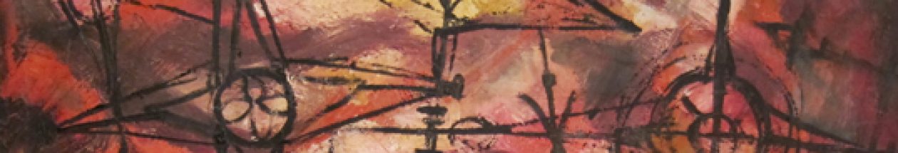
Some of her work I feel is brilliant. Art appreciation is subjective of course. Naturally, I am biased. But I will be honest and say some of it doesn’t move me, but I do have what I think is a good aesthetic eye. In the vernacular of the common man, some of this is very good stuff!

What is called art, what people pay to hang on their wall, what appraisers see as worthy or not, is largely about personal taste. But worthiness in the art appraisal world also rests on an artist’s auction history, or what academia has written, or what museums choose to value or exhibit.

I don’t know the first thing about art markets- but I do think markets can be cultivated, and not necessarily in a monetary sense, but rather, from an aesthetic perspective. Can one sense exist without the other? I don’t know.  The value of an object is the price it will bring.  I am not vain enough to think that this little blog is going to create a sensation in the art world, or that my finished thesis, as a published paper, book or documentary, could ever establish my aunt as a famous artist.  That is not my objective.

What I want is for her to have a searchable history. She has a clear, established reputation at Clarke University. There may be other pockets of aficionados out there that I do not know about. My aunt’s oeuvre may always remain somewhat obscure. (I’d love to own an original some day and wouldn’t that be ironic if I ended up pricing  myself out of a market I helped create!?) Ha! In my best Yiddish accent, “such a problem I should have! Oy!”

Seriously, what I would like to see, perhaps in my lifetime, is that occasion in the future when some man or woman gets in line at the Antiques Roadshow taping, or takes their mysterious painting into their local appraiser and asks, “I inherited this crazy, wild explosion of color-and I’d like to know more about it or the artist who painted it.”

I would like those questioning faces to receive an informed answer. I worry that some day, someone will tote said painting to that AR appraiser, and he or she will scratch their heads and say, “I have no idea.” I worry my aunt’s work would be passed aside as an unknown entity. Dismissed. Dismissal appears to be linked directly to knowledge. Knowledge is good. How unfair it would be to have one of her paintings evaluated – unrecognized in the context of her entire output.  That it might be assessed without consult or without the proper information? That would be sad. Maybe it wouldn’t bring anything in an auction, but I would want that appraiser to be able, at the very least, to educate its owner on the background and biography of the artist.

So it is my wish that this humble contribution, and the research yet to come, will lay a foundation of information for any appraiser to tap into and use  as a means to assess an aesthetic, if not monetary value. I’ve made my aunt “Google-able.” That’s an important first step. I hope to attach further knowledge, opinion, research and high quality images to those searches and keywords. To be able to go to the Internet, maybe someday my published thesis- a book, and be able to share, “Oh, yes, that is a SMJA piece. She was a Roman Catholic  nun who studied, taught and painted in Iowa and who…..”

That kind of appraisal would be beyond value!

Forgiveness 10/12

Actual title, year, medium unknown. Courtesy of Clarke University

I called this Forgiveness because I see a figure kneeling in the middle of the painting, it’s hands outstretched and palms up. It faces a great white light and touches the light peripherally, as does one knee. Most of the figure remains in the natural world, with browns, dark golds and greens on the outside, and a heated red-orange closer to the figure.

The red-orange may represent evil, or the fires of hell. This person is in the hotseat, in the middle of heated passion or turmoil.

This figure has hope. Through prayer, he calls back the blessings and peace of a higher power. The goodness of God, his grace, his forgiveness is approaching and is moving toward the figure.There is some white in the center that could be the hand of God, ready to embrace the figure.

Huddled in the light 3/12

Title and year unknown. Courtesy of Clarke University

My aunt clearly, returned to themes of good vs. evil, light against dark. To the left I see at least three  faceless figures (with dark hair), and maybe more with lighter hair, huddled together, basking in the light, in protection of white and yellow light. To the right, ceding the canvas’ territory to the light figures, is a red figure.

He is evil. He is the Devil. His large eye is fixed on his target, his claw-like hand reaching in to grab. Or,is it recoiling back- unable to penetrate God’s protection? I think the latter.

These are just initial impressions. More on this painting later. Nine more to post!