Tag Archives: structue and form

Blue Triumph 12/12

Photo provided by the Sisters of Charity, BVM, Mt. Carmel in Dubuque, Iowa

This large painting, which I call Blue Triumph, is part of the permanent collection at Clarke University. The date my aunt painted this is unknown, but it would be prior to her leaving to go to San Francisco in the late 60s. This could be late 1950s or early 1960s. My best guess is approximately 1966.

I am not a world traveler! Does the large blue structure, center left, look familiar?  This shape, which I associate with the modern Under Armor logo, appears in many of her paintings, but none as large as this one. I could be mistaken, but I see shades of suggestion that this represents the base of the Eiffel Tower.

The perspective is a low to high vantage point. I’ve studied the painting a long time. I see a young girl in the bottom right, her tawny face in profile, mouth agape at she takes in the splendor of the structure. I see her wearing a blue beret that has slid onto the back of her head, almost touching the knapsack she straddles on her shoulders. This girl is a student tourist, perhaps one of my aunt’s students from Clarke.

The sky is mottled with intensites of blue. Hints of green lawn tell me this is a spring or summer visit. An early morning or late afternoon sun bounces of the arch and bathes the sidewalk with sunlight. A red flag on the structure hovers directly above the girl’s forehead.

What do you think?

Salvaged Memories

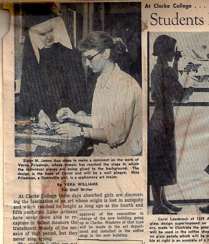
Verna Friedman was one of my aunt’s students at Clarke College in the 1950s. She has been very generous sharing her memories of my aunt. Earlier this spring, she sent me some clippings and a piece of work my aunt did as a class demonstration and then discarded in the trash. Verna decided to pick it out and save it. As she remembers:

“She did demonstrations in class. I think she did most of her painting outside of the Open Studio. I still have one of her demonstrations on shape and line. She was throwing it away and I salvaged it. The drawing is in the “Ecce Homo” style.  She taught the freshmen studio classes and gave us a solid foundation in the Elements of Design (breaking up space) which applies to abstract as well as representational art.” ~VF

This does not represent what my aunt would normally have considered as displayable art. Verna wasn’t sure my aunt would want it made public, for her it was something to discard. But as I consider myself her pupil, I find it useful and fascinating. I can imagine her, back then, wearing her boxy habit that was the style in at the time (can I call it a style?) and picture her explaining the placement of lines, space and color to her students. I can also imagine the sketches, doodles, experiments and exercises that were tossed in the trash and never recovered!

A simple teaching exercise, never meant to be displayed, but discarded in a trash can until salvaged! Meji by SMJA

It feels very “fifties” doesn’t it? Interesting how the outline of Mary’s halo and the kings’ crowns transition from black to white against different backgrounds. I assume the freedom to do that is one of the lessons of the drawing, the use of contrast, the selection of color and the simple fluidity of the lines. It is more than a sketch- but something my aunt didn’t feel necessarily worth holding on to. I am grateful that Verna thought otherwise and was kind enough to share it with me!

Verna was also kind enough to share two newspaper clippings she had saved:

SMJA and Verna Friedman at Clarke, 1956. SMJA is wearing the habit worn in the 1930s through 1950s

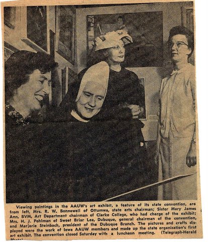
And this clipping shows my aunt’s interactions with Dubuque’s art community and exhibitions,

Clipping from Dubuque Telegraph Herald, 1957. Her habit and been modified and was surely more comfortable.

Mid Century Iowa Art

I have to start checking my junk mail more regularly. Ever have a trusted name or domain slip into your junk mail for some reason? Well maybe it’s coincidence that the 13th discovery came to me in that manner- but I was indeed LUCKY that I scanned the numerous Viagra and replica Rolex watches and found this:

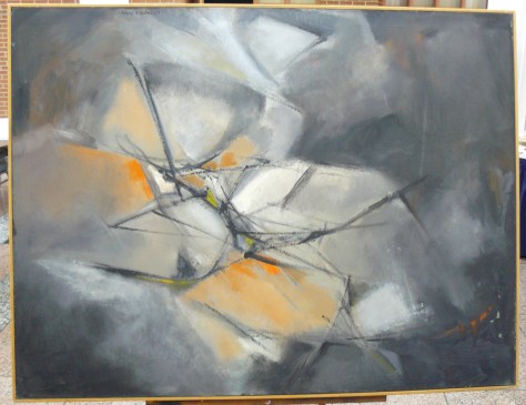
Courtesy of Clarke University. Title, date and medium unknown

Bridges 1/12

Year, title and medium unknown. Courtesy of Clarke University.

This is my favorite of the 12 images sent to me by Dr. Sara McAlpin, BVM.  The first word that came to me was bridges, so that is the working title. I screeched with delight when the CD she mailed me unveiled this!

Now that  I have looked at this a second time, I could see so many more titles. Steeples, forest trees, humans- hands and legs, something is reaching and arching up. I see support, the dark lines swirl and reach out to other structures, a gold, amber light has meandered in, bounced around the other structures, reflected perhaps. The light is shared, and I would say absorbed. Triumph-Joy-Strength. Connections and synapses, broken and joined, trying to rejoin.

The darkness, such as it is, is not black, devoid of light, or evil. Rather the shades of green and brown indicate nature, and nature in transition. None of the shades, light or dark, are static or absolute. They are all in transition. The solid black- the objects- are fluid, erect, but curving and soaring. Sprawling, multiplying from the goodness and sustenance of the natural world.

In the center, I see tiny cross hatches or vertical lines. This little detail bodes toward the bridge impression. I am not ready to give up om my initial impression. Are they people? Are they bridge railings?  You do not see cars- so this is a pathway yet untraveled- a journey through a changing landscape-a pathway that might be a wild ride!