“Art matters because it provides a communication tool between an artist or designer and the diverse audience who encounters the art. This encounter may generate thought, stimulate conversation, or evoke emotion.
When we first wake up and become aware of light and shape around us, we see. This is a passive experience. We look when we focus our attention on specific objects, images, or details. Looking is active and engaging.
A beautiful piece of art is pleasing to the eye and soul. Sometimes sad and ugly stories need telling and they might be disturbing and uncomfortable. These scenarios share a common goal: to capture attention and to elicit a reaction. Sometimes thinking is more important than liking.” ~ Rodney Allen Schwartz
This gallery will soon feature one of my aunt’s paintings, Iron Crosses, Bruges.
After a flurry of emails back and forth, I was connected to Chris van Lierop, whose parents were Rev. Richard E. Nelson and Mrs. Dorothy Rawlings Nelson.
I received this lovely note from Chris:
“I looked again at your website. Iron Crosses is in the background of the newspaper photo dated Feb 18, 1960. That article mentions Cedar Falls. I assume that my parents met Sister Mary James Ann at that time.
My father was campus pastor at Norther Iowa U at that time. In that capacity, he organized exhibits of religious art at the student center on campus on Serely Blvd. We lived in that building when I was born in 1956 and for the first three years of my life. I had assumed that my parents met Sister in connection with one of the exhibits they organized. But perhaps it was at the other exhibit in Cedar Falls mentioned in the article.”
My family moved to Duluth, MN, in 1964. Iron Crosses hung in our dining room there for 45 years!
Chris also shared that Iron Crosses, Bruges was donated to the Westminster Presbyterian Church in Minneapolis. She provided me with a photo that was provided by Dr. Rodney Allen Schwartz, director of the Westminster Gallery and Archive, who has given me permission to use it here:
Iron Crosses, Bruges is inspired by a cemetery in Belgium that features hundreds of iron crosses slowly rusting. Courtesy of Westminster Presbyterian Church, Minneapolis
However, Chris did inform me that the painting in the background of this clipping is Iron Crosses, Bruges. I would have never known unless I saw the original!
Iron Crosses, Bruges is behind my aunt on the wall. It is vibrant in reds, golds, oranges and pinks! News clippings provided by Clarke College (University).
According to a 1960 article SisterJamesAnn_1960, my aunt was inspired to create this along with many other images during an art student tour of Europe.
I have never been to Belgium, but I was curious about what my aunt may have been looking at. I found this picture from a Google search – I couldn’t find who owns it but it was on a website called dipity.com
Iron Crosses, photo found on dipity.com
I also found this YouTube video searching for photographs. Not all of the images shown in this video are of crosses made of iron. Some ornate crosses are found individually on top of headstones, and this collection, set to lovely music, shows the same area photographed above, but dusted with snow. I think it sets a pensive tone.
Chris is also going to try and find some old family photographs where the painting hung in the dining room! The painting was 48″ by 34″ tall.
I will discuss the detail of the image at a later date here.
Verna Friedman was one of my aunt’s students at Clarke College in the 1950s. She has been very generous sharing her memories of my aunt. Earlier this spring, she sent me some clippings and a piece of work my aunt did as a class demonstration and then discarded in the trash. Verna decided to pick it out and save it. As she remembers:
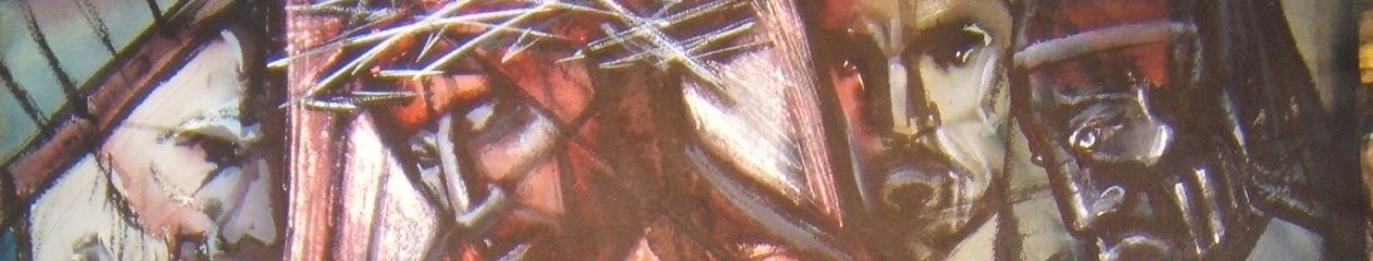
“She did demonstrations in class. I think she did most of her painting outside of the Open Studio. I still have one of her demonstrations on shape and line. She was throwing it away and I salvaged it. The drawing is in the “Ecce Homo” style. She taught the freshmen studio classes and gave us a solid foundation in the Elements of Design (breaking up space) which applies to abstract as well as representational art.” ~VF
This does not represent what my aunt would normally have considered as displayable art. Verna wasn’t sure my aunt would want it made public, for her it was something to discard. But as I consider myself her pupil, I find it useful and fascinating. I can imagine her, back then, wearing her boxy habit that was the style in at the time (can I call it a style?) and picture her explaining the placement of lines, space and color to her students. I can also imagine the sketches, doodles, experiments and exercises that were tossed in the trash and never recovered!
A simple teaching exercise, never meant to be displayed, but discarded in a trash can until salvaged! Meji by SMJA
It feels very “fifties” doesn’t it? Interesting how the outline of Mary’s halo and the kings’ crowns transition from black to white against different backgrounds. I assume the freedom to do that is one of the lessons of the drawing, the use of contrast, the selection of color and the simple fluidity of the lines. It is more than a sketch- but something my aunt didn’t feel necessarily worth holding on to. I am grateful that Verna thought otherwise and was kind enough to share it with me!
Verna was also kind enough to share two newspaper clippings she had saved:
SMJA and Verna Friedman at Clarke, 1956. SMJA is wearing the habit worn in the 1930s through 1950s
And this clipping shows my aunt’s interactions with Dubuque’s art community and exhibitions,
Clipping from Dubuque Telegraph Herald, 1957. Her habit and been modified and was surely more comfortable.
Rate this:
Portrait of a mid-century contemporary artist, AKA Ann Walsh